Efficiency Map by DEWETRON
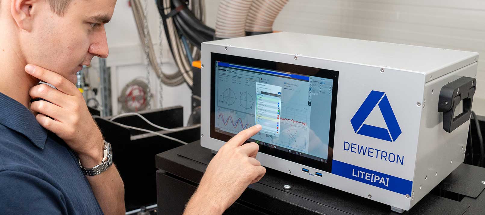
DEWETRON’s measurement software OXYGEN continuously evolves. As a part of this development, a matrix sampler feature now complements OXYGEN (starting from version 5.2). The matrix sampler is a powerful tool that also enables the creation of an efficiency map. Do you want to know more about efficiency maps and their creation in OXYGEN? Then keep on reading and download the dedicated whitepaper at the end of the page.
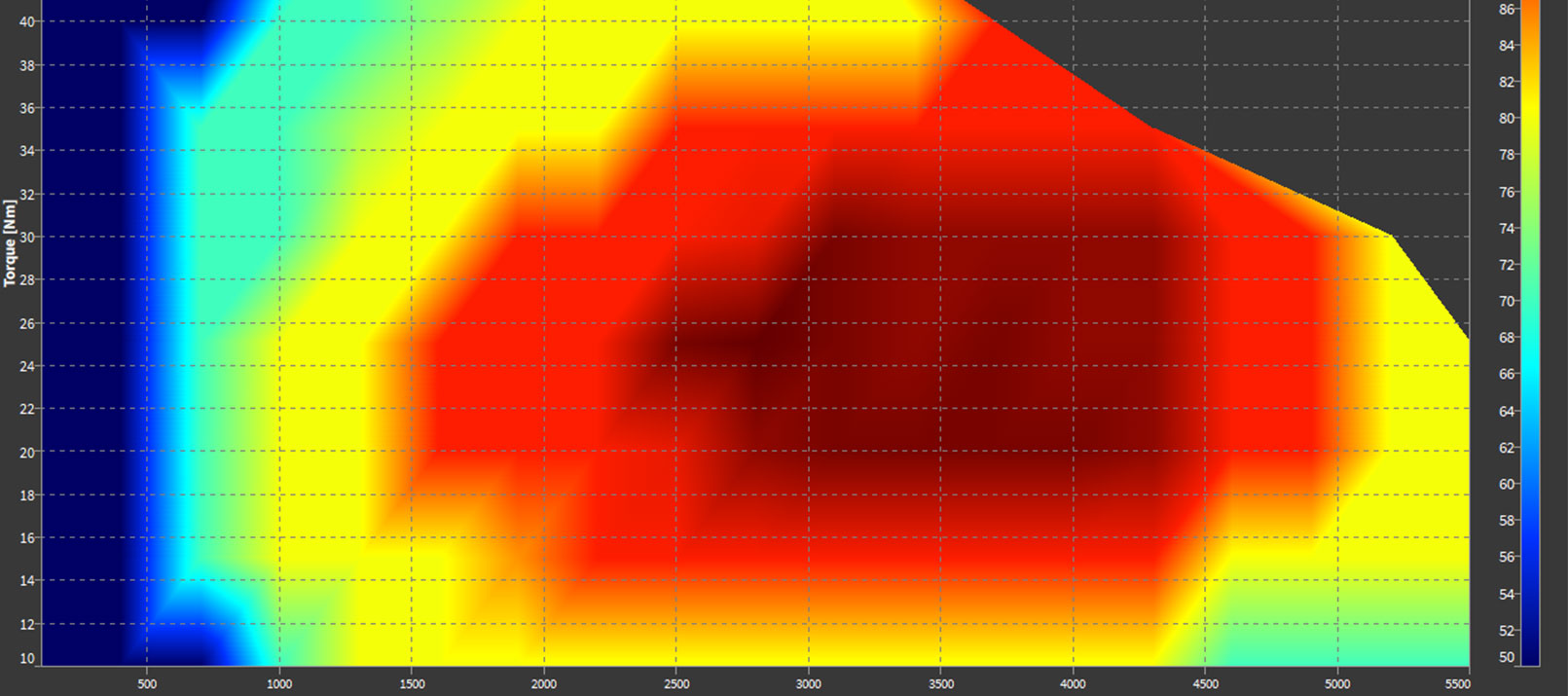
What is an efficiency map?
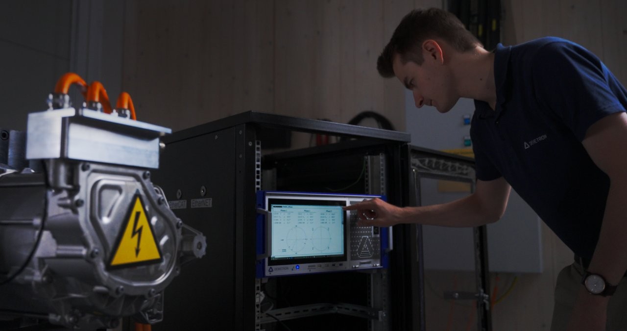
DEWETRON’s efficiency map is a color-coded visualization that displays the relation between speed, torque and mechanical efficiency. It describes the efficiency of a DUT over a defined range of operating points. As a result, an efficiency map allows you to design components in a way that maximizes the total efficiency for the regular working areas. This finds use for instance in drivetrain testing. For the visualization, you can select a linear interpolation or various level grading options.
Please mind: This feature is not just an efficiency map but a matrix sampler that you can use differently as well. Instead of using speed and torque, you can also visualize the dependency of an arbitrary input signal to two freely definable reference channels.
How to create an efficiency map in OXYGEN?
Verena Niederkofler, one of DEWETRON’s experts, prepared a whitepaper treating exactly this topic. Included, you get a step by step explanation that guides you through the configuration of an efficiency map. In the whitepaper, Verena explains the input signals you need for your efficiency map, how to create the required power group and she also elaborates on the visualization of the instrument.